WellNU
Directing students to wellness resources
7 weeks (Oct - Dec 2024)
Introduction & Research
Context
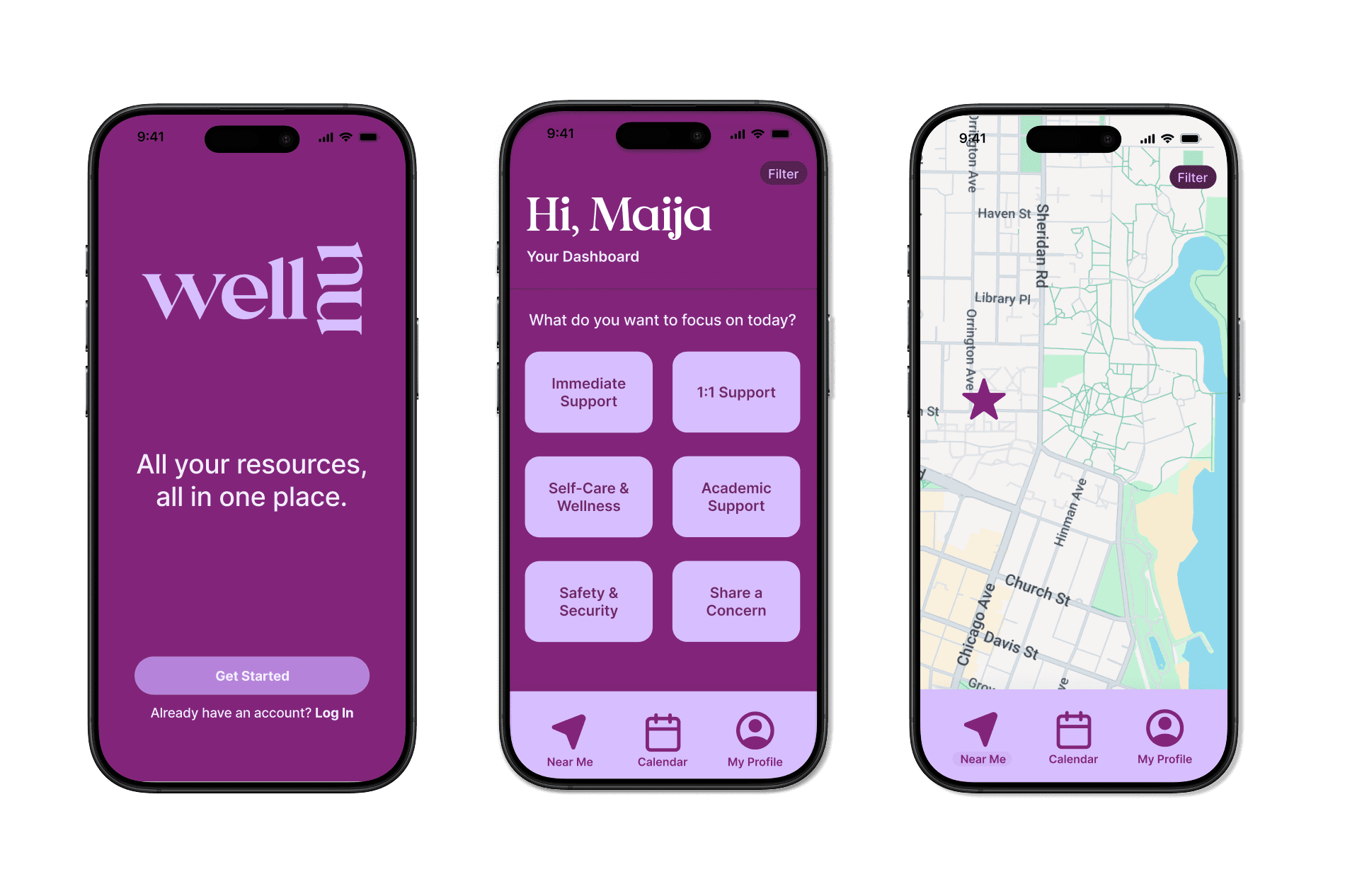
What is WellNU?
WellNU is a mobile application designed to simplify student support by centralizing Northwestern’s wellness resources into a simple and intuitive platform. Developed through a course at Northwestern (Design Thinking and Doing), this project marked my first UX project and venture into product design.
The Rundown
Finding the right support is burdensome and time-consuming.
When it comes to seeking support, students struggle. At a demanding institution like Northwestern, it often feels impossible to prioritize wellbeing amidst academic rigor- not to mention the fast pace of the quarter system. I’ve experienced this struggle firsthand, and speaking to students on campus reaffirmed just how prevalent the need for help is. I sought out to address the problem at hand: How might we design a product that reduces the friction of accessing mental health resources?
User Research
How are students prioritizing and accessing mental health resources?
To gain an understanding into Northwestern students' habits with utilizing mental health resources, I conducted a series of interviews across campus locations, with conversations revealing insights and gaps in how students navigate university resources in their academic journeys. After empathizing with students, I identified a few common criticisms and key insights:

Analyzing user research, I developed personas to transform my core audience's needs, painpoints, and goals.

After compiling user interview data and analyzing the feedback patterns, I identified two critical pain points that Northwestern students face when trying to access wellness resources, directly informing my product vision for WellNU:
Resource Discovery Barriers
Students struggle to find appropriate wellness resources due to scattered information across multiple platforms and no clear entry point. As one student noted, "Whenever I need help, I just give up halfway because I don't know where to start." Multiple interviewees noted that resources are "under-marketed" and difficult to locate when needed most.
Accessibility During Stress
When students are already experiencing mental health challenges, they lack the bandwidth to navigate complex, disorganized systems. One student summed up this frustration perfectly: "If I'm stressed, I don't have time to search through a huge website." This insight revealed how the current system places additional burden on students precisely when they're least equipped to handle it.
The Current System

When students need support, they need to find it quickly — but the current layout of wellness resources online (demonstrated above) makes this a stressful and time-consuming process. Building up the courage to ask for help is already difficult; adding the burden of navigating scattered resources can deter students from seeking the care they need.
Ideation, Development, & Iteration
Identifying Opportunity
These findings drove me to develop the product vision: consolidating Northwestern's wellness resources into a format that is intuitive, easily accessible, and specifically designed to support students during moments of stress and need. Through user research, it was clear that simply having resources wasn't enough - their organization and presentation were equally critical to student wellness outcomes.

To assist with ideation and brainstorming, I created more in-depth "HMW" statements to spark product ideas. From there, I was able to narrow down and prioritize the most high-value features to solve user needs. Given the time constraints and insights gathered from users' feedback, I refined the app's scope to focus on features that were both impactful and achievable within the project timeline.
The app is…
a tool to find resources faster
a starting point for students
a way to make mental health on campus feel more approachable and inclusive
The app is not…
a platform that dictates what students should use
a replacement for existing resources/services
a diagnostic or prescriptive tool
With my areas for opportunity and painpoints in mind, I drafted four core design principles to guide the design process: simplicity, accessible and timely, clarity, and interactive.
Once I narrowed the features targeting the principal user needs, I drafted low-fidelity wireframes of the app screens to visualize the flow, key features, and gather feedback from users. This way, I prioritized quick iteration to ensure user-friendliness.

Prototype & Test
In user testing, the iterative process proved to be quite tedious and time-consuming. I realized that what could seem so intuitive to me as the designer can just as easily turn out to be puzzling to a user, and thus prompted (many) changes in my design. I was thankful to have opted to mostly test with low-fidelity prototypes, allowing me to iterate as much as possible before really committing to design choices.
User testing proved crucial for the entire navigation of the app, evolving into a dock-style layout for the app. This decision helped simplify user interaction and made it easier for users to quickly access resources without feeling overwhelmed. It also informed me of what features users felt were most important to have. Initially, I had considered a "settings" category, following common app UI trends, but user testing revealed that it wasn’t necessary for the app, ensuring a more focused and efficient design.

Core Features
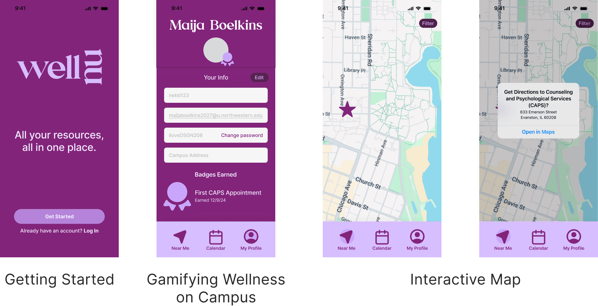
Solution
WellNU is an all-in-one, accessible and intuitive platform helping to direct students to the support they need.

Conclusion
Completing my first ever UX project!
This project and course was my first introduction into design thinking and product design. I stepped into the quarter with a preconceived idea of what design was— a somewhat narrow vision that focused primarily on aesthetics and visual appeal. Through my project however, it dawned on me how design is far more than a creative exercise; it’s a deeply empathetic, analytical journey in understanding and addressing real needs. Ultimately, I think that this was the most salient realization, leading me into pivoting aspirations of pursuing product design.
Let go of the designer ego and let the user lead!
Tossing away my perfectionism was a big challenge. When I tested with users, I realized that what felt intuitive to me as the designer didn’t always resonate the same way with them. I learned to embrace iteration and remain open to feedback to prioritize user needs. Each iteration demanded critique and feedback and a willingness to deconstruct and rebuild initial concepts.
If I had more time…
I would have loved the chance to turn more of my ideas into fully realized prototypes, as there were so many concepts I couldn’t bring to life during the design process. Ultimately, I had to narrow my project scope to stay on track for the course, but I’m eager to revisit these ideas in the future and explore how they might enhance user experiences. Balancing creativity with practical constraints was a valuable lesson in prioritization.