
Lead Product Designer,
Team of 4
Feb 2025 - March 2025
SKILLS
Interaction Design, Visual Design, Prototyping, App Concepting, User Testing
Figma, FigJam
SUMMARY
MealMates is an app that turns the chaos of shared cooking into an easy, collaborative experience. With synced schedules and real-time kitchen availability, MealMates helps roommates avoid conflicts, plan meals, and even connect over cooking.
PROTOTYPE OVERVIEW

A PRESSING PROBLEM
Uncoordinated meal plans and cooking timing spark roommate tensions, stress, and food waste.
When juniors move off-campus, they face a sudden shift from dining halls to full food independence. Meal planning, grocery shopping, and cooking collide with shared kitchens, busy schedules, and uncoordinated roommates—leading to stress, conflict, and food waste.
USER RESEARCH
Contextual Inquiry
To understand the chaos, I conducted a contextual inquiry with a Northwestern junior sharing an apartment with three friends. Grocery shopping was weekly, chores rotated, and meal planning relied on memory rather than structure. The lack of structure meant missed ingredients, improvised substitutions, and multiple roommates buying the same thing.

Groceries:
bought weekly, split informally


Chores:
on rotation, but loosely followed
KEY PAIN POINT
No system, just guesswork
Meal planning and grocery lists were informal, relying on memory and unspoken cues. The lack of coordination caused missed ingredients, substitutions, and wasted opportunities.
COMPETITIVE ANALYSIS
Where do current solutions fall short?
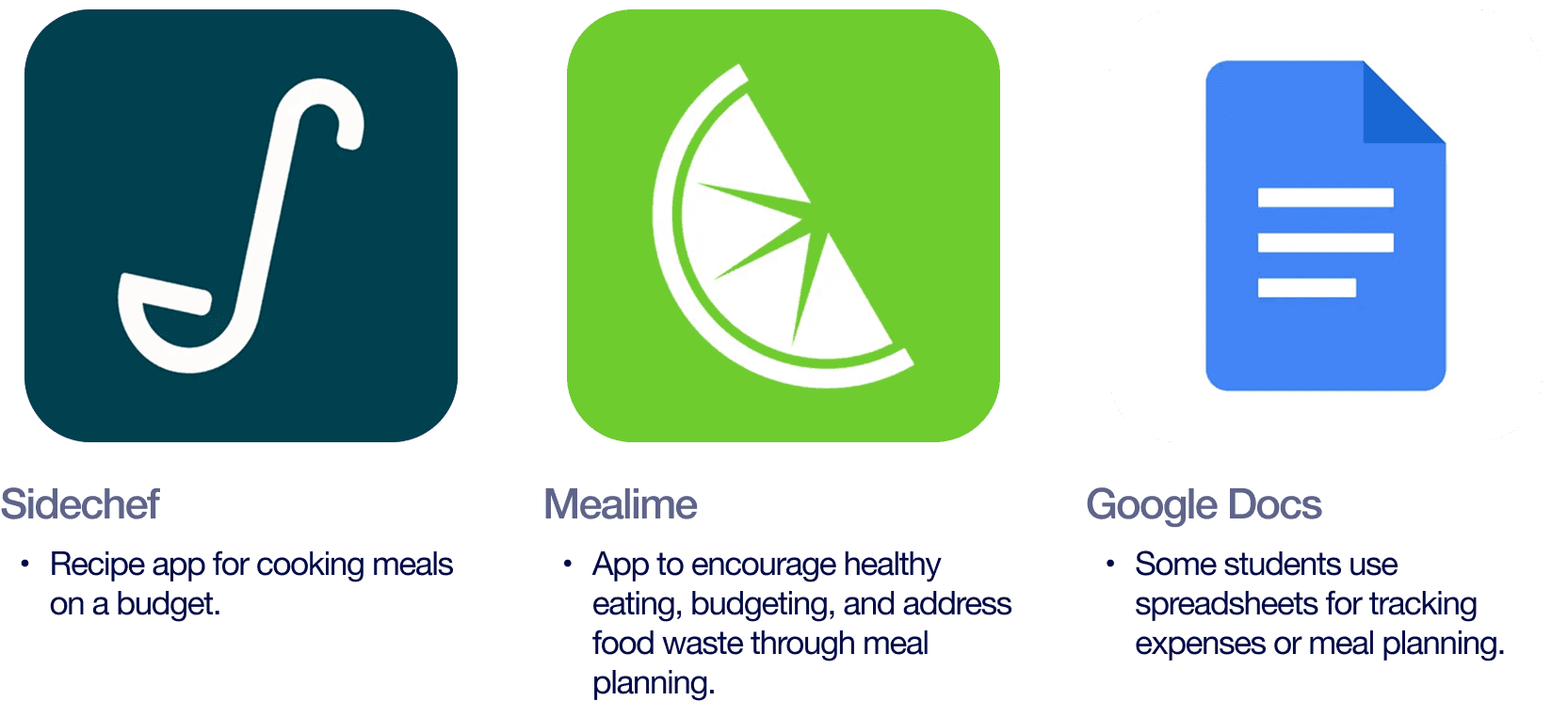
Competitive research confirmed the gap we had seen. There was no single tool to handle meal planning, ingredient sharing, and kitchen scheduling in one place.
FINDING THE FOCUS
Narrowing Scope
We began with a big vision: groceries, chores, cost-splitting, and more. But research made it clear: the kitchen was where tensions boiled over most. Focusing on cooking coordination offered the fastest path to impact.
GOALS
Support upperclassmen in navigating the transition off meal plans
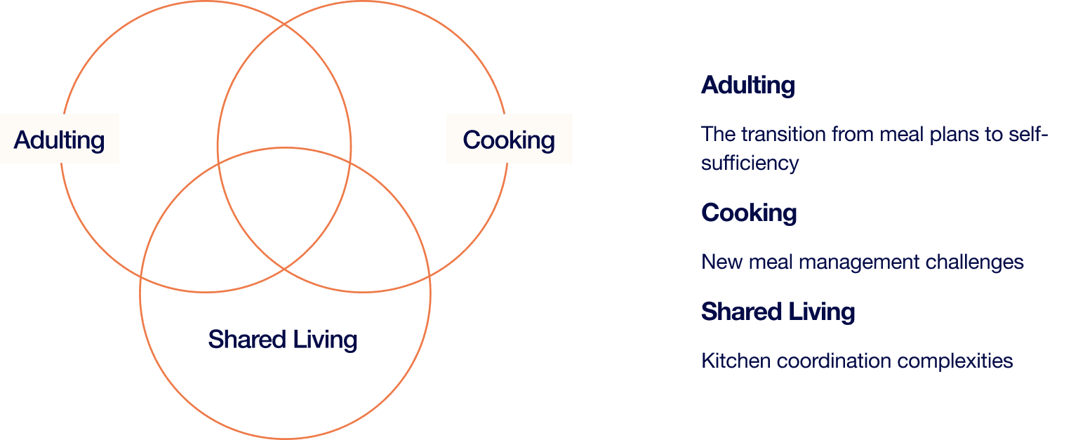
At the intersection of these three themes is where Northwestern upperclassmen feel the most pressure. Our user research revealed students struggling not with any single aspect, but with the combined weight of these new responsibilities.
DESIGNER GOALS
Address multiple lifestyle challenges through a single, cohesive solution
Create tools that fit naturally into students’ busy, varied schedules
USER GOALS
Cook and manage meals efficiently
Navigate shared kitchen use with minimal conflict
Balance new responsibilities without feeling overwhelmed
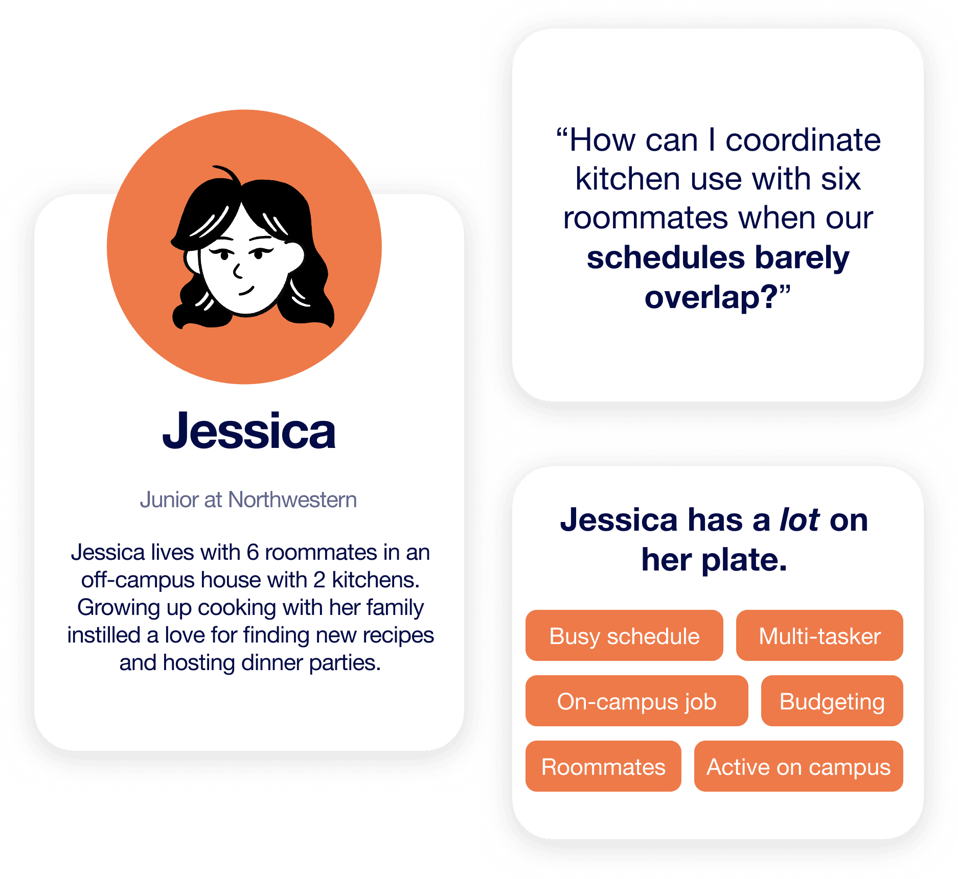
USER PERSONA
Setting the scene…
IDEATION
Wireframing challenges to compare concepts and identify winning elements
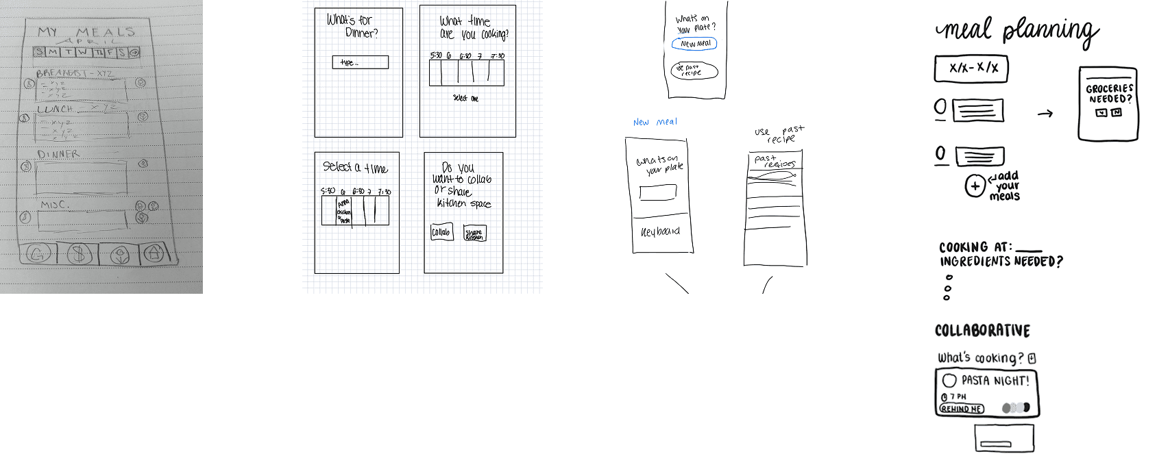
We began with a “Crazy Eights” wireframing exercise, where each of the four team members sketched eight different ideas for the app’s interface, ranging from full flow sequences to individual design concepts. After comparing and discussing our sketches, we identified key visual directions for the prototype and brought those into Figma.
ITERATIONS
Initial Concepts
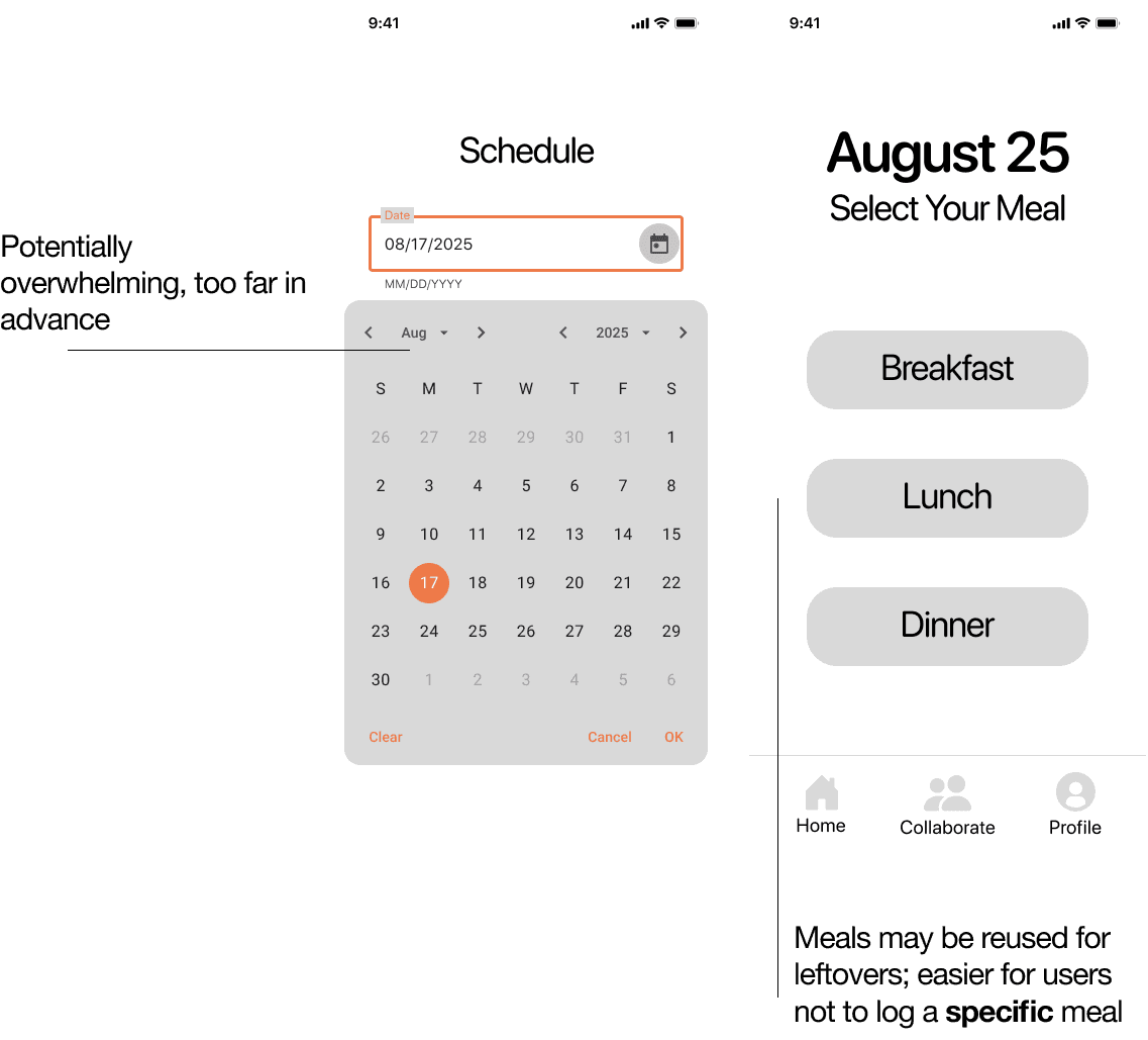
Our first Figma concepts included a calendar-based approach, but testing revealed it felt rigid and overwhelming.
Students wanted flexibility: a quick way to log meals, not a strict plan for every bite.
DESIGN APPROACH
Minimalist approach to meet core needs
That insight of flexibility led to the “Log a Plate” flow, a minimalist approach that was easy to start using right away. We chose a minimalist style to emphasize functionality and effectively address user needs during testing.

We used this flow for our user testing to gather feedback on usability, and iterate on the interface for a smoother, more satisfying experience.
USER TESTING & ITERATION
Identifying usability issues
Even within this short flow, users reported issues that could be problematic, like ambiguity in the prompt "What's on your plate?" While thematically fitting, this was identified by both users and instructors as unnecessarily ambiguous.

To resolve this, we explored other approaches that maintained our tone while improving clarity for users. This led to opting for a direct, action-oriented cue (“Log a Meal”), erasing hesitation and ambiguity during critical user touch points.
DESIRED FEATURES
What we heard from users
User testing pointed to two must-have features:
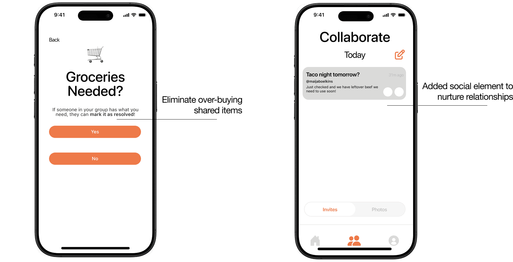
Shared Grocery List: avoid duplicates, track who’s bringing what
Collaborate Screen: cooking invites + shared updates to make kitchen time social
FINAL DESIGNS
After many rounds of ideation, iteration, and user testing, we present MealMates!
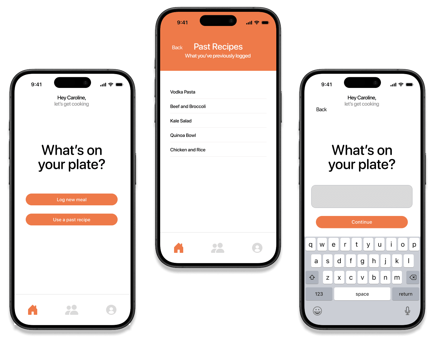
Log a new or existing meal
Easily add what you’re cooking, reuse past recipes, and mark leftovers for future use.
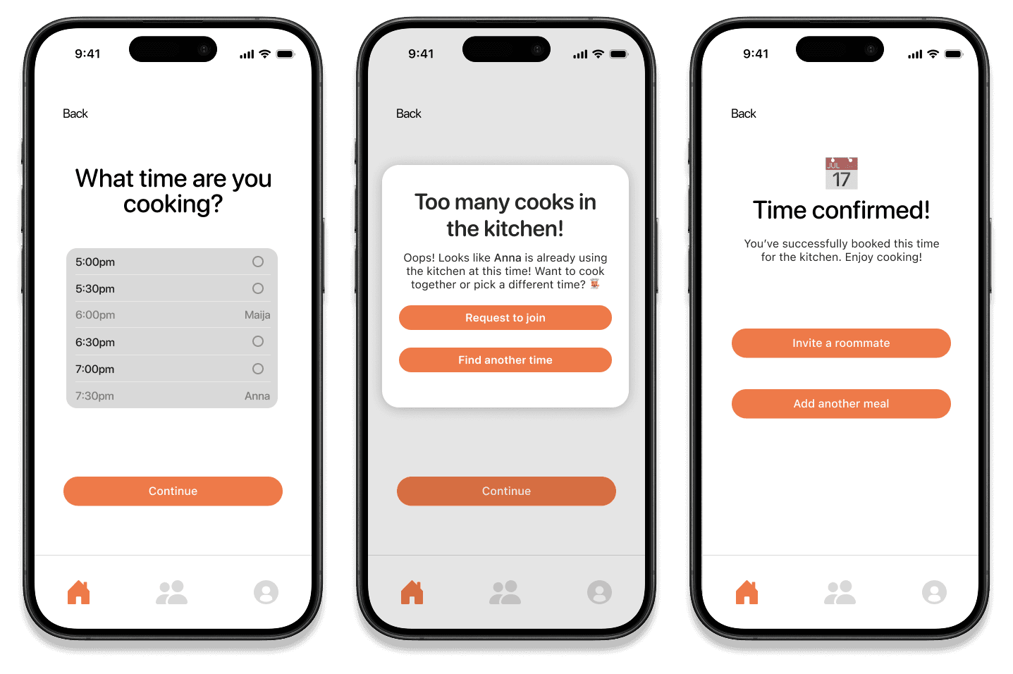
Schedule in real-time to cook in shared spaces
Claim a slot or join a roommate’s, reducing conflicts and making it easier to coordinate around busy schedules.

Social and Collaborative
Post meal photos, send invites, and flag ingredients that need using.
TAKEAWAYS
Balancing ambition and feasibility
We started with an ambitious vision: a single app that could tackle multiple aspects of off-campus living: groceries, chores, shared finances, and more. Through ideation, prototyping, and user testing, it became clear that trying to tackle everything at once would dilute impact. Narrowing our focus to kitchen coordination and meal planning allowed us to design with intention, delivering a solution that truly addressed users’ pain points.
Iterate, test, repeat
Design decisions came from continuous testing. We debated on using calendars vs. simple logs, chore wheels vs. collaborative invites, and ultimately prioritized flows that felt most intuitive for real-world use. Iteration revealed features we hadn’t considered initially, like grocery sharing or social invites for cooking together. This reaffirmed how important it is to center the user around every design decision.
Applying usability principles
Using our knowledge from class, we grounded our design in Nielsen’s heuristics, emphasizing minimalism, visibility of system status, and matching real-world expectations. Even minor changes like renaming “What’s on your plate?” to “Log a Meal” improved the clarity and reduced hesitation at critical touchpoints.
Looking ahead
If we had more time, we’d expand grocery coordination, refine social features, and explore personalized experiences for different off-campus household types. The MVP shows that thoughtful focus can solve one problem exceptionally well, while leaving room to grow!